
|
||||

 Contents
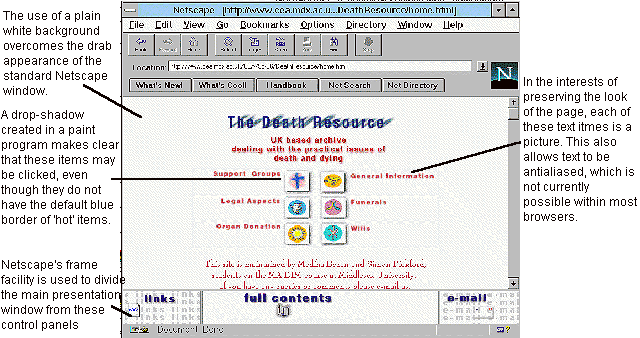
The aim of this Web site is to provide, in a clear and accessible way, information which will be of immediate practical use to those involved with a death. A design was needed which offered openness and informality without appearing trivial or patronising.
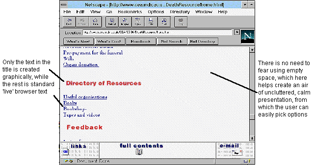
It is particularly important that the visual and interaction design of such a site does not get in the way of clear and effective communication. The opening page presents a simple and uncluttered appearance.
It is of course essential not to misuse such graphical conventions for things which in fact are not active.
Rendering the text in a graphics program overcomes these problems, but at a price. The download time will be longer, more work is required of the designer, and the text cannot be found by any searching process (since to the machine it is just graphic pixels). Text-only browsers will not display these graphics at all, so it is essential to use HTML's ALT attribute within the <IMG> tag to put a textual substitute in place of each missing graphic.
Items which need to be constantly available to the user are presented in three Netscape frames at the bottom of the screen. The links item only presents links to existing sites created by others, and deliberately does not include links which are internal to this site. The e-mail item allows the user to mail an enquiry or comment at any time (the browser opens its e-mail facility when the user clicks on this area), using the mailto: mail_address form of URL.
However, as browsers become better able to support the positioning of information within a single frame, and selective updating within single frames becomes possible, the need for the frame structure may decline.
From an information design point of view, frames are regrettable since they introduce yet more screen-furniture which is not part of the actual information.
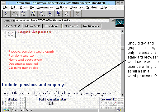
If frames are not used, and therefore there is no place to present a separate set of navigation controls, then it is also considerate to provide navigation buttons at the top and bottom of a long document, and even, for a very long document, at intervals in between.
It is important to remember that not all displays show the same area of pixels, so that it is always unwise to make assumptions about what is and is not within the user's view.
Contents
Graphics Multimedia Virtual Environments Visualisation Contents