This report is also available as an Acrobat file.

 Contents
Authoring and Design for the WWW
DESIGN CASE STUDIES
The Heal Trust
The site offers information about a distinctive medical
charity. The client wanted to use a very large amount of text to explain the
charity's policy. There is an assumption of a high level of commitment on the
part of the user which may not be justified. The screen is perhaps not the right
place to present extended text documents, though this can perhaps be countered
by the fact that users can print out such text for reading from paper.
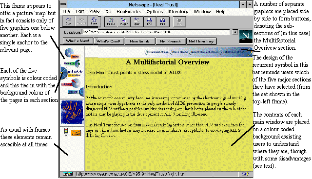
One of the tasks facing the designers was to make the large
quantity of data manageable. Part of the approach adopted was to use five
colour-coded sections.
Colour-coding
In this site, the five major sections were similarly colour
coded in the five buttons' in the top-left navigation panel frame and in the
background colour of the main text frame. In this way, users can easily tell
which section they are currently reading. However, since not all users will see
colour, the cue is also reflected in the form of the recurrent symbol for each
subsection which become visible in the top navigation bar.
Navigation controls
The use of frames provides an easy way of giving the user
an overview of the site and means of getting to its various parts, independently
of other frames which may change. In this site, two navigation bars one top left
and the other across the top of the screen together provide means of reaching
both sections and subsections of the site. This is more congenial for the user
than multiple clicks to make hypertext jumps from one text to another (see
diagram).
Where such controls are graphical as well as textual, users
are assisted in remembering the sections which they have visited before by
distinctive symbols and colours.
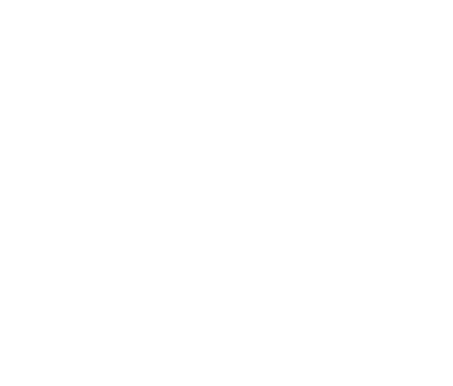
The parts of the Heal Trust site form a matrix. Any part can be reached quickly using two
sets of navigation controls which are
always on screen
Contents
Graphics Multimedia
Virtual Environments Visualisation
Contents
