This report is also available as an Acrobat file.

 Contents
Authoring and Design for the WWW
DESIGN CASE STUDIES
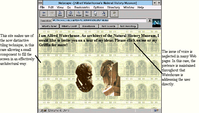
The Museum Building Site
The site aims to sensitise the user of the Natural History
Museum to the museum building as architecture, rather than just a container of
objects. The building is unusual in that it was purpose-built to reflect the nature
of the collections which it houses, with extensive use of natural-world motifs in
stone and other materials. Typical use is envisaged to be before or after a school
visit to the museum itself.
Who's talking?
A neglected issue in the design of Web sites is that of
language, and in particular voice. Different media, and different genres within
those media, require different styles of address. Radio, television, newspapers,
encyclopaedias, business letters, novels all adopt very different language styles.
A letter sent by e-mail will usually differ from one sent on paper, having
something perhaps in common with a telephone conversation. By contrast,
many Web pages, especially those produced by HEIs, have a deadening
formality derived from validation documents and departmental reports.
The right language for the Web?
No one yet knows what is the natural language of Web
documents, but since the technology makes possible the construction of many-to-
many documents rather than the traditional one-to-many model of HEI
information, we would argue for a multivocal and varied approach which is not
limited to any particular style of address. There will be occasions for formality,
and authority, but there will also be many occasions when a feeling of
immediacy and informality is far more effective. There is much to learn from
radio and television in this respect.
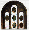
A simple navigational device used in the Natural History Museum site, representing the
actual physical orientation of the parts of
the building described. Users can see which section they are in by observing which
lozenge is missing from the window.
A context-sensitive navigation control
Providing a navigation control which allows the user to
click on any major section, and which then displays clearly which part the user
has selected, seems a modest requirement of any hypermedia system. However,
within the technical limitations (at the time this site was developed) it proved
surprisingly difficult. The simple but cumbersome solution adopted here was to
a have a different version of the navigation graphic for each of the seven areas,
each with the appropriate lozenge missing! This is just the sort of weakness
which will decline as the Web acquires a fuller set of features from mainstream
multimedia. One solution to this problem is to make a control panel as a
Shockwave file, and offer it in a frame of its own, though this in itself is not
ideal (see Archaeology Adventure site next ).
Contents
Graphics Multimedia
Virtual Environments Visualisation
Contents
