This report is also available as an Acrobat file.

 Contents
Authoring and Design for the WWW
DESIGN INTO PRODUCTION
Some basic principles of information design
We said that grouping and alignment are powerful cues in
organising information. Nevertheless, graphic designers have frequently
resorted to even stronger means of directing the eye and dividing up a page,
including horizontal and vertical rules, and boxes around information.
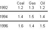
In this version of the table, rules are used to emphasise the profile within each year.
However, such emphasis can often be created
simply by the use of grouping and spacing. It is never useful to provide strong rules
both vertically and horizontally.
Often, such means are excessive. Frequently they violate
one of the basic rules of information design: that the content should be
presented strongly while any supporting information which simply assists in
presenting the content should be relatively weak. (see Tufte passim)
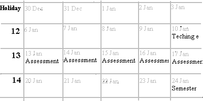
The default style for tables in Netscape is an example of good information design, in that
the grid is presented in a muted tone
which does not compete with the darker text within it. In this example, the small
dates in the individual cells have also been set to a
weak tone so that they do not compete for attention with the substantive
information.
Sadly, Netscape introduced the concept of frames which,
while they certainly solve a number of problems both of design and delivery,
do so at the cost of filling the already cumbersome Netscape window with yet
more obtrusive screen furniture. See Design Case Studies for examples of
frames as a solution to various practical difficulties of delivery and presentation.
Colour
What we loosely call ' colour' can be though of as having
three components:
- Hue green, red etc.
- Saturation colourfulness, freedom from grey
- Tone the tonal value: lightness or darkness
Since hue is psychologically the most obvious of these, it
is tempting to think that difference of hue is the most useful attribute available to
the designer. However, it is tone which is in fact the most important. For
example, in order to distinguish a text item from its background, one might
choose to set it in red on a background of blue these two hues after all could
hardly be more different. However, legibility will be poor, since the red and the
blue are likely to be of similar tone. It is tonal contrast, not difference in hue,
which helps distinguish adjacent colours, allowing the text to stand out clearly.
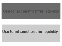
In the upper example, red text is placed on a blue ground. In the lower example,
text in the same shade of red is placed instead on a
light grey background.
Differences in tone also have great significance in
providing emphasis, dictating what the user sees as important: large differences
of tone (high contrasts) make information stand out, while small differences
(low contrast) make a more muted statement. On a well-designed map, specific
information such as the locations of towns will be marked in a strong tone such
as black, while background information such as contours will be indicated with
less tonal prominence. This phenomenon was used in the design of the timetable
grid shown above (under Framing).
This effect can also be enhanced by the use of saturation
where unsaturated (weak or dull) colours are used for background information,
while more substantive information uses saturated (vivid) colours such as red or
green. Such usage also pleases our subjective preferences concerning saturated
colour large areas of vivid colour tend to tire and aggravate the eye, which
prefers muted shades over large areas.
Colour coding
It is also a mistake to ignore tonal values
when choosing a range of hues for use as colour codes. A common mistake is to
put text or other items in say red, green, blue and yellow. While it is possible to
find a red, a green and a blue of roughly equal tone, the yellow will always be
much lighter and, if on a white background, approach invisibility (see the Case
Study p85 for an example).
Where documents take advantage of the Web's natural use
as an international publishing medium, assumptions should not be made about
the symbolic association of hues. For example, the association of black with
death and white with weddings is by no means universal, and even within one
culture colours can change their meaning over time and within cultural
subgroups.
Remembering colours
When colour is used as a code, it
must be recognised that we have poor perception of colours which are isolated
from one another, and weak memory for colours when they are no longer side
by side. For example, if we must remember which of two shades of green
signifies the further info' section and which the help' section of our Web site,
then both colours must be present when the user makes his or her choice.
Otherwise the user will easily mistake one green for the other in the absence of
an opportunity to compare them simultaneously.
Restraint in colour
It has been said of screen design
that it is best to start with a tonal design, in shades of grey, and then apply
colour selectively and with restraint where it is needed. The toolbar of the
Netscape interface conforms roughly to this approach. However, if the Web is a
publishing medium, it offers the freedoms as well as the responsibilities of any
such medium: we will not want to limit ourselves to (literally) dull pages,
especially if motivation of the reader is a key factor. As with paper publishing,
on some occasions an extremely sober presentation will be required, while on
others we may want a carnival vividness on the screen. As always,
appropriateness will be the acid test.
Nevertheless, Web publishers should bear in mind some
good reasons for treating colour carefully:
- Colour vision
Not all users see full colour. About 8% of the male
population and 0.5% of the female population has anomalous colour vision.
Colour should not be used for critical coding unless additional information also
distinguishes the elements (see Using colour redundantly, below)
- Monochrome displays
Not all users have access to colour displays, or may have
temporarily set their machines to display in greyscale only.
- Platform differences
Colours which are distinguishable from one another on
one display, may look similar on another. This can be caused by the different
ways in which the exact colour specification of an element is mapped to the
colour table used by a particular interface such as Macintosh or Windows. It
may also result from differences in display hardware, especially between say
cathode ray tube monitors and LCD screens. See Non-Dithering Colors in -
Browsers', listed in Web Resources, for a partial solution.
Using colour redundantly
Colour provides a powerful
adjunct to communication and to the motivation of the user, but should not be
used as a the sole means of conveying important information. Other cues should
be used so that the colour does not have to do all the work alone. A familiar
example is the use of the underline, redundantly with colour cues, in the way
browsers display hypertext anchors.
Contents
Graphics Multimedia
Virtual Environments Visualisation
Contents
