|
||||
| Also available as an Acrobat File | 

|
|
cdv Alternatives to choropleth maps |
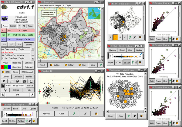
Maps of the Census: a rough guide4. The use of cdv to visualise the Population Census.The notion behind cdv was that data exploration required the kinds of speed of response common to most desktop point and click graphical user interfaces (GUIs) and expected by most computer users, abstract graphics that were suitable to help identify patterns, and the flexibility to create novel and particular views of data sets. Despite considerable advances, software dealing with geographic information still tends to produce graphics that mirror traditional production cartography with slow, intricate maps, and an emphasis on realism and beautiful reproduction rather than symbolism. It was envisaged that a graphics front-end to a spatial data set could take advantage of the GUI features without being slowed down by GIS baggage. Tcl/Tk (Ousterhout, 1994) is a GUI-builder particularly appropriate for rapid development and which contains a canvas widget on which symbols can be plotted at specified locations. The types of symbolism that can be programmed compare well with the elements identified by Bertin (1983) and others, and give excellent scope for creating abstract views of spatial data (see Dykes, 1997a). The capabilities for changing symbolism and updating views by linking events to cursor/mouse combinations are varied and powerful, meaning that Tcl/Tk is extremely suitable for dynamic mapping for exploratory map use (Dykes, 1996, 1997b). Cdv takes two ASCII files, one containing a series of unique identifiers followed by enclosing co-ordinates, and another containing rows beginning with an identifier and followed by ratio-scaled attribute fields. The range of each attribute is calculated and a polygon plotted using the enclosing co-ordinates. The polygon is filled with a grey shade from 100% intensity (white) to 0% (black) based upon the data value within the range. The result is a classless choropleth map of the type shown as Figure 11. Polygons can be interrogated for information about their location and value and a point and click GUI allows users to select data elements and a variety of views of the data.
Figure 13:A look at cdv - Linked geographic and statistical views. Here long-term illness / capita is shown on a classless choropleth and population cartogram. Those on government employment schemes are shown by a dot plot and scatter plots show the relationships between three age categories. A dot plot showing illness/capita has been used to identify locations of the extreme values in the other linked views. As Figure 13 shows, these include dot plots, box plots, scatter plots, circle maps, and parallel co-ordinate plots. In a cdv session, the emphasis is on transience and the user is encouraged whenever possible to adapt the cartography used to highlight specific information. Re-scaling, zooming and panning of views, and user-defined data classification, colour schemes and symbol scaling are supported. All views are dynamically linked, meaning that when a symbol is interrogated with the cursor, or when a group of symbols are selected with a lasso, symbols corresponding to those chosen in one view are highlighted in all others. This means of alleviating the traditional cartographic enigma of showing three dimensions of variation on a two-dimensional plane is illustrated in Figure 14.
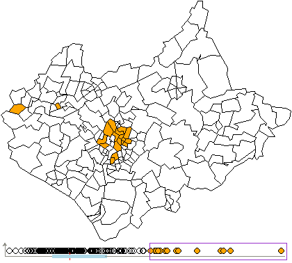
Figure 14: Long-term illness / capita. A dot plot uses locations to show the range of data values, with a box plot identifying the median and quartiles. Extreme values are selected interactively with a lasso and highlighted on the map view. Data sub-sets can be selected, either spatially to focus attention on particular geographic areas, or by attribute values to re-scale the data range for more precise mappings between symbolism and value as shown in Figure 15.
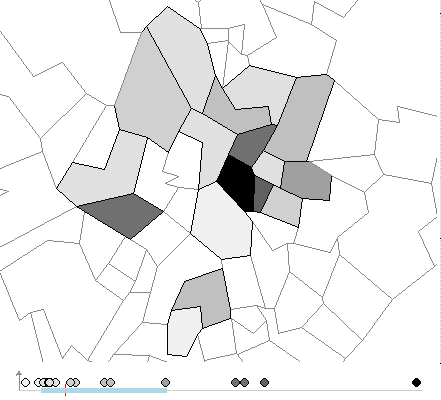
Figure 15: Long-term illness / capita. Here the extreme values highlighted in Figure 14 have been selected as a data sub-set and new views created to show the variation within that data range. The map has been interactively re-scaled and panned to show the area where most of the extreme values occur. The vast opportunities for symbolism in Tcl/Tk and interpreted nature of the scripts add a degree of flexibility for further prototyping. Scripts can be extended to suit particular data sets or specify additional functionality to views. The provision of a series of tutorials and examples (URLs 3 & 4) supports this notion of an open visualization resource or toolkit of ideas. Cdv also includes some unsupported prototype extensions. These include procedures to create contiguity matrices and visualize local statistics based upon adjacency neighbourhoods, to create and interrogate semi-variogram clouds, to display local parallel co-ordinates plots based upon distance inclusion of zones selected along a user-digitised route and the addition of raster images as backdrops. |
Graphics Multimedia Virtual Environments Visualisation Contents