|
Editorial
Abstract
Introduction
The Issues
Numbers
Areas
Symbolism
Dynamic mapping tools
cdv
Alternatives to choropleth maps
Conclusions
Future directions
Acknowledgements
References
Case Studies Index
|
Maps of the Census: a rough guide
2. Issues to consider when area value mapping
In this section we outline and illustrate some of the standard ideas from
cartography about good and bad practice in choropleth mapping. These have been
grouped into sections on the numbers mapped, the zones used, the classification
into class intervals and the symbolism employed.
2.1 Issues concerning the numbers
Figure 2 shows the same data as were used in Figure 1, but instead of
mapping numbers that express the areal density of the population we have simply
attempted to visualise the total population.
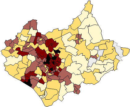
Figure 2: Total population of Leicestershire at the 1991
Census.
In this example the inner city wards that have the highest populations also
have small spatial areas, so that the pattern remains similar to that shown in
Figure 1. In other cases large zones may tend to have large population totals
and vice versa, so that the effect of the zones used is that the map
tells us very little about the underlying distribution. The distribution of
population is better revealed by mapping a ratio, in which the total count is
expressed relative either to the area over which it has been aggregated (giving
an areal density) or to some population total (giving a population
ratio). Figure 3 shows a population ratio, the percentage of the population
aged between 0-15. The transformed variable mapped is now a dimensionless
quantity whose value is not dependent on the areas of the zones used, but the
map still contains a dependence on the areal units in that physically large
areas tend to dominate the display.
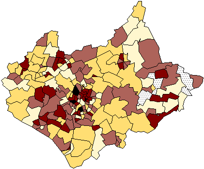
Figure 3: Total children aged 0-15 expressed as a proportion of the
total ward populations, Leicestershire 1991.
Depending on the problem being studied, it is possible to refine the numbers
used in several ways to provide more revealing maps. Some options to consider
are:
- Standardisation of the denominator in ratios mapped in some problem relevant
way. In spatial epidemiology, for example, use is often made of Standardised
Mortality Ratios (SMR) which are the ratios of the number of deaths in each
area to those expected on the basis of some externally specified (typically
national) age-sex specific rates. More generally, in a Census Atlas (CRU 1980)
produced using the 1971 Population Census of UK, a team based at Durham
University mapped a number of variables using as a measure the so-called
signed chi-square statistic. This was defined as the squares of the
differences between the actual numbers in the zone and those expected if the
variable in question were uniformly distributed over the entire area divided by
this expected total as in a conventional chi-square statistic. Use of the
square of the differences necessitated each chi-square value to have its
positive (more than expected) and negative (less than expected) signs to be
added after the calculation. A simpler alternative is to map the square root of
these quantities (Oi - Ei)/ sqrt(Ei) which
automatically takes care of the sign. Figure 4 shows the distribution of number
of cars in each ward expressed as a chi-square relative to the expected number
per capita. The calculation clearly draws out attention to greater than
expected car ownership in the larger rural areas in a clear commuter belt
stretching south-eastwards from Leicester and the smaller inner city wards with
less than expected car ownership. The chi square value automatically emphasises
the greater significance of variation in zones with more cases.
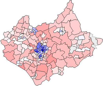
Figure 4: A chi square map. Total numbers of cars relative to the
numbers expected under the assumption of uniform distribution throughout the
population. The large map shows the full range with low values dark and high
values light. The smaller maps use the full range of grey shading to focus on
the areas with fewer (top) and more (bottom) cars than expected given their
population totals.
- A common problem in any such mapping is where either the numerator or
denominator in the ratio mapped is very small and this often occurs when the
cases being mapped are rare or of very high spatial variability. The result is
that the ratios become very unstable to small changes in these data. In such
circumstances it is sensible to map quantities that are more robust to such
changes. Instead of mapping the ratio of observed to expected counts, the
probability of getting a count more extreme than that actually observed
can be mapped. Such a map must be based on some probability model and that
usually employed is the Poisson, as is appropriate for an assumption of a
random distribution of the individuals. Details of the approach and is
assumptions can be found in Bailey and Gatrell (1995, pages 300-302).
- Another alternative where there are small numbers involved is to adjust the
estimated ratios in each zone either away from, or towards an overall global
value for the rate according to some prior measure of our confidence in these
ratios using concepts from Bayesian statistics. For a very clear introduction
to this method see either Marshall (1991) or Langford (1994).
- A number of recent workers have suggested that in many cases it is appropriate to visualise using what have been termed local statistics. Typically, in using local statistics we attempt to learn more about each individual zone by relating it in some way to the values in its neighbours. Several local statistics have been suggested and their use illustrated. For example, Getis and Ord (1992; see also Ord and Getis, 1995) define a G-function which gives an index of spatial clustering of a set of observations over a defined neighbourhood as Gi (d) = å
wij(d). x j / å
xj. Here x is the regional variable and W(d) is a symmetric 0/1 matrix of weights with 1's for all the areas defined to be within distance, d, of the given area, i. All other elements are zero, including the link of i to itself. Computation of G(d) requires a suitable data structure from which to determine the W(d). The vector of values for each region, G(d), shows how locally anomalous the region is with increasing distance for the given variable, x . Each area has its associated G-function that can be mapped for given d, or plotted as a function of distance. A restriction on this statistic is that as defined it is only useful if the variable has a natural origin. It is thus inappropriate for the study of change variables or variables that have negative values. Second, Anselin (1995) has shown that global coefficients for measuring spatial dependence, or spatial autocorrelation, can be decomposed into local values. These include Moran's index of spatial autocorrelation, I, and Geary's contiguity ratio, C. The local form of Moran's I is the product of the zone value and the average in the surrounding zones, Ii (d) = zi . å
wij (d) . zj and the local variant of Geary's contiguity ratio is Ci (d) = å
wij (d) . ( zi - zj ) 2. Almost any of the classical statistics can be calculated as a local value (for example the mean, standard deviation and correlation). This idea has recently been exploited by Fotheringham et al. (1996) who compute maps of how the estimated parameters of a regression model vary spatially over a fine grid of cells. Maps of these estimates provide additional information about the spatial stationarity of the phenomenon being mapped. Figure 5 shows a map of the values of each zone's local departure from the neighbouring values (expressed as a local z-score) again using the data for children aged 0-15.
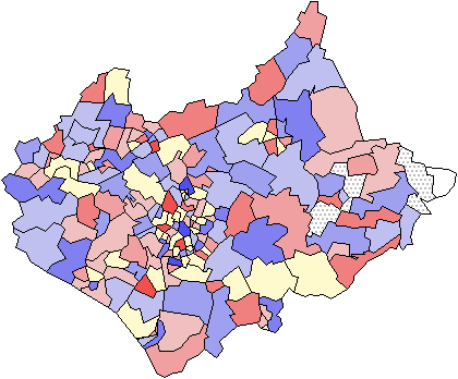
Figure 5: A map of a local statistic. Maps show percentage of the
total population aged 0-15. Variation from the local mean is calculated as a
z-score. The main map shows local lows and local highs ranging from light to
dark. The small maps show positive and negative outliers mapped with darkness
to represent magnitude in the top and bottom maps respectively. Localities are
defined by first order adjacency.
|


