|
||||
| Also available as an Acrobat File | 

|
|
The Issues Alternatives to choropleth maps |
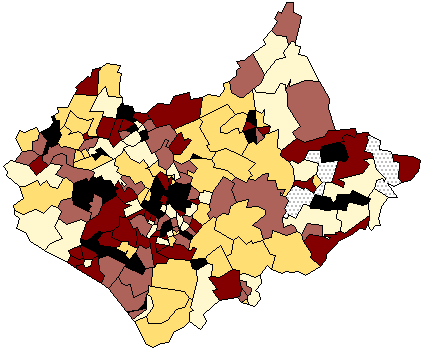
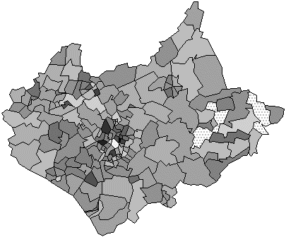
Maps of the Census: a rough guide2.3 Issues concerning the symbolism:Prior to the introduction of computer cartography all choropleth mapping had an additional step between the assembly of the data values and their visualisation using symbols on the map. This was to group values into a limited number of discrete classes. Each class was then assigned a shading category on the resulting choropleth map. Not only did this greatly simplify the labour involved in drawing these maps, it was also justified on the grounds that the map reader could not readily distinguish between more than a limited number of shade categories (Dobson, M, 1973). It also overcomes the problem of simultaneous contrast, where the appearance of grey values is influenced by surrounding shades. Classification provided scope for enormous variation in the resulting displays given by the choice of both the number of classes and the class limits, or bins. Most texts in cartography have extended discussions on these topics (see for example Dent, 1990, pages 153-178) and it is relatively easy to show that different choices can lead to very different displays. Figures 9 and 10 show the data for children aged 0-15 using two differing, but traditional classification schemes. It can be seen that the message they give might also differ. Figure 9 has a five class scheme using equal value intervals to define the bins, whereas Figure 10 has the same number of classes but an attempt has been made to get an equal number of cases into each class.
Figure 9: A choropleth map of the proportion of children aged 0-15, using five classes based upon an equal bin interval classification scheme.
Figure 10: The same data visualised using the same number of classes but a different classification scheme. Here equal numbers of wards are classified in each bin. Most authorities agreed that if a choropleth map is to have classes, then it is best to use a limited number, typically 5 or 7, but the choice of classification scheme is by no means simple. In a classic paper on the problem, Evans (1977) lists over twenty We need to include the number... I think it's about 28! I couldn't find the paper. possible alternatives and his basic recommendation is that the selection of scheme should always be based upon an inspection of the overall statistical frequency distribution of the zone values. Choropleth maps produced with computers allow very gradual and subtle variations in colour. In 1973, the American geographer Waldo Tobler suggested that it ought to be possible to create shade patterns that would vary continuously in relationship to the variable being mapped (Tobler, 1973). Tobler's software did this by varying the spacing of the lines in a shading pattern. Others experimented with FAX technology to provide a 255 shade grey scale (Muller and Honsaker, 1978). Modern PC screens support 16 million colours, with 256 shades of grey and so effectively unclassed maps are easily produced. Figure 11 shows such a display using exactly the same data as were used in Figures 9 and 10 but filling each zone with a grey shade in exact proportion to its value. That it is visually very similar to the five-class equal interval scheme used to create Figure 9 should be obvious, and there is a literature on map user's perceptions of such continuous choropleth shade maps (see Muller, 1979; Petersen, 1979).
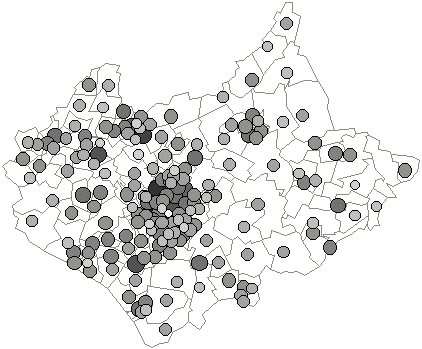
Figure 11: A 'classless' choropleth of these same data using a continuous grey scale. A final problem in conventional census mapping is the symbolism used. Most of the illustrative figures we have used have a grey scale applied uniformly over the zones mapped with the darker shades to represent higher values. It should be clear that in an ideal world this symbolism will be 'read' as a linear sequence in which 'twice' as dark would indicate a doubling of value and so on. The psychological evidence is that this is difficult to achieve. An alternative is to abandon shades of grey as indicators of value and instead use symbol size. Figure 12 shows the same data as Figures 10 and 11, but we have used a located proportionate symbol to signify value. The symbolism is identical to that used in the non-continuous cartogram (Figure 7) but locational information is retained at the expense of symbol overlap.
Figure 12: A graduated circle map of the same information. The circle areas and shading are proportionate to the zone values and the circles are located at an assumed centroid within these areas.
Faced with these problems and sat at a workstation capable of producing many millions of colours, the temptation might be to try to use a graded series of colours in choropleth mapping. Our straightforward advice is that you use a scheme that has a natural progression of hues and lightness as recommended by Brewer (1994), such as the scheme we have utilised in the colour versions of these pages. As was shown many years ago by Jacques Bertin in his classic book Semiologie Graphique (Semiology of Graphics, English Translation of 1983) colour is best used to show qualitative differences, not the quantitative intensity that we need when mapping census data, and the main reason for this is that what we see as 'colour' has more than one dimension of variation. Although we might specify a colour using the RGB system, what appears is generally regarded as having three components of variation, the hue (the colour itself) its saturation (its intensity or brilliance) and its value (lightness or darkness). Not only this, but different hues produce differing responses in the eye brain system. Some, such as yellow, are dominant, others, such as blue, are recessive. Add to this the fact that everyday use gives certain colours special significance (such as red for danger, at least in western societies) and you have a recipe for what in Monmonier's words is 'a cartographic quagmire' (Monmonier, 1991, page 147). This is not to say that colour isn't useful in choroplethic mapping. It is particularly useful in showing a bi-polar scale with positive and negative values as, for example, might result from a calculation of a percentage change in population. Figures 4 and 5 demonstrate the difficulty of representing a bi-polar distribution in monochrome and a coloured alternative. If you really feel that it is necessary to colour census maps of single variables, then it is vital that you first read some of the literature in the field (Mersey, 1990; Monmonier, 1991, 147-156; Brewer, 1994). |
Graphics Multimedia Virtual Environments Visualisation Contents