|
||||
| Also available as an Acrobat File | 

|
|
Visualising trajectories |
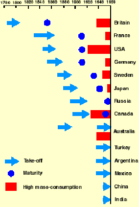
Mapping the Life Course: Visualising Migrations, Transitions & Trajectories 4. Visualising Trajectories in the `lives' of nations and regionsThe examples discussed so far concern people's lives, but the methods are relevant to any entity capable of change over two or more dimensions: firms are created, merged and de-merged, and closed down; products and political parties are `repositioned' in the marketplace. Two final examples concern nations and regions. Firstly, perhaps the best know `transition diagram' in the history of the social sciences, and one of the most problematic. Nations, like people, follow a variety of paths but Rostow's `stages of economic growth' (1960) allows them just one: arguably, the American Way. Even though the fallacy was demonstrated decades ago, students still arrive at university having been taught this model, arguably a testament to the power of graphics. Treatments such as Solow's (1970) may contain far more insight into the real processes of economic growth, but though it contains diagrams they provide detail not overview. Rostow's diagram shows the fundamental danger of two dimensional visualisations in this field: if one axis is time and the other distinguishes cases (just like the SEM diagrams above), there is no space within which nations can follow different paths and as with individual life-cycle models the only variation is in timing.
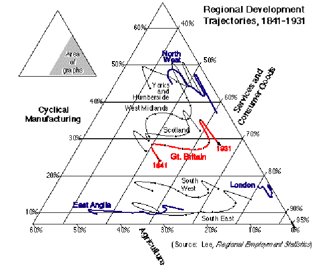
Figure 9: Walt Rostow's `Stages of Economic Growth' Figure 10, taken from Gilbert & Southall (1994) takes a slightly more sophisticated approach to the economic development of the regions of Britain, plotting their trajectories in terms of industrial structure between 1841 and 1931. It attempts to present five dimensions on a two dimensional surface: time, the three economic sectors and the geographical dimension which distinguishes the regions. Despite its complexity, this is still a simplification from the original statistics for 32 sectors and 52 counties. It should be apparent that each of the three regions highlighted in blue followed a markedly different path, and the national path (in red) was an average between these very different patterns. Figure 10: Regional Development Trajectories,
1841-1931 |
Graphics Multimedia Virtual Environments Visualisation Contents