|
||||
| Also available as an Acrobat File | 

|
|
Visualising transitions |
Mapping the Life Course: Visualising Migrations, Transitions & Trajectories 3. Visualising other Transitions in individual lives
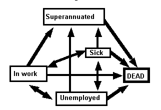
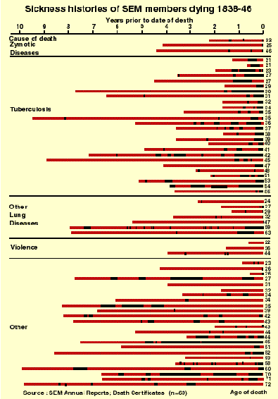
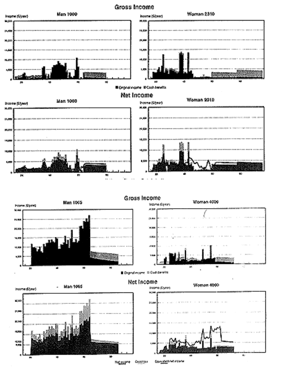
The above examples all concern transitions between places or trajectories through space, but similar methods are applicable to other dimensions of the life course. The Figure 6 shows a series of possible transitions which can affect the individual worker, reducing their productivity and increasing demands on welfare systems; note that the only transition out of superannuation is death and that there are no transitions from death. The Steam Engine Makers (SEM) database, used above to study migration, records all these transitions for this particular group of C19 workers. The Figure 7 (from Southall & Garrett, 1991) shows the sickness histories for SEM members; note that time can be expressed in three ways: years from birth, indicated by the ages on the right-hand margin; years before death, shown on the horizontal axis; and, missing here, the actual calendar date. One rather obvious comment about what this figure shows is that men who died of TB tended to be sick for lengthy periods prior to their deaths, while those dying of `violence' (mainly industrial accidents) experienced little prior sickness. Other studies taking similar approaches are Savage (1993) on the career paths of banking workers, which he uses to explore gender differences and the emergence of the `modern career', and Alter (1988) on the linked migratory and fertility histories of Belgian women. These examples are all `historical', but to some extent any study of lives as a whole must span decades. The issues addressed by such life-course research are of great contemporary significance; for example, Falkingham & Hillis (1995) in ESRC-funded research explored the relationship between variations over the life-course and between lives in net benefits from state welfare systems. Differences between lives are critical, but their presentation is limited to just four samples as shown in Figure 8.
Figure 7: Sickness histories of SEM members dying
1838-46 Figure 8: Gross and Net Lifetime Incomes for Two Simulated Couples The above graphs concern not real people but sample output from micro-simulation models. The horizontal axis is years from birth and the vertical axis is income, either from work (in black) or from benefits (in grey). For example, man 1000 (at top right): "has a poor employment record. He leaves school at 16, and being unable to find regular employment, receives Supplementary Benefit (SB) from age 16 to 20. Because of his interrupted work history he only receives Unemployment Benefit in the years when he is 23 and 24 (during which entitlement runs out) and when he is 38; at all other times when he is out of the labour market he is reliant on SB. The only time he pays significant amounts of tax, reducing his net income [lower graph] below his gross income [upper graph] is during his mid-30s". Conversely, man 1065 (at bottom right) remains in full-time education to age 20 but then receives a much higher income until retirement at age 65 (see Falkingham & Hillis, 1995 pp.77-82). |
Graphics Multimedia Virtual Environments Visualisation Contents