Creating a 2-D Column Chart
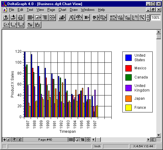
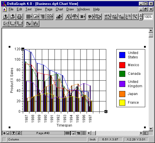
Column charts are mainly used to compare one item to another, or to compare different items over a period of time. Column charts are effective in showing dramatic changes from one category to another. Here’s the 2-D column chart that we’re going to produce in this section of the tutorial:-
Data for the Column Chart
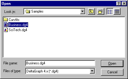
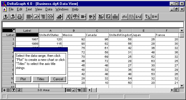
The data for the column chart has already been prepared and stored by Deltagraph. It is held in the Samples folder within the main Deltagraph folder (called Dg4 on the system that this tutorial was produced on). To load the data, proceed as follows:-
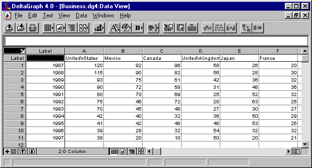
When loaded, the data is displayed as follows (after changing the page name by selecting Name Page from the View menu and setting the name of the data page to ‘2-D Column’):-
How Column Charts Work
If you are unfamiliar with column charts, they work as follows: the data in the first column (i.e. in this case the years 1987 to 1997) will be used to label the ‘X’ axis (i.e. the horizontal axis), with the data in subsequent columns being plotted against each year and represented as a rectangular column whose height is directly proportional to the particular value against (in this case) each country. For example, for the year 1987, the United States has the highest value (120) and France has the lowest value (20). For that year, the USA will be represented on the column chart by the highest column and France will be represented by the lowest column, with the other countries being represented by columns whose heights lie between those of the USA and France, with Canada being 2nd highest, Mexico 3rd highest, the UK 4th highest, and Japan 5th highest. In order to easily compare values across the years, each country’s column (in this example) is assigned a different colour; the USA is blue, Mexico is red, Canada is green, and so on. Using colour may not always be appropriate if the chart can only be displayed on a non-colour device. In that case, rather than colours, different patterns are used to represent the different countries. (Notice that we don’t, in this case, know what the values associated with each country actually represent. They could represent anything capable of numeric representation and comparable across the six countries).
Plotting the Column Chart
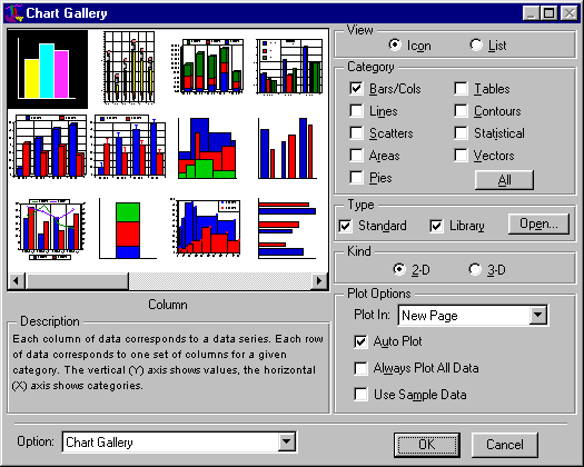
Firstly, select the Chart Gallery from the Data menu and, in the dialog box which is displayed, set Category to ‘Bars/Cols’, select ‘2-D’ for Kind, and select Column chart from the gallery, as follows:-
Now click on OK. The following Deltagraph window should be displayed:-
Now:-
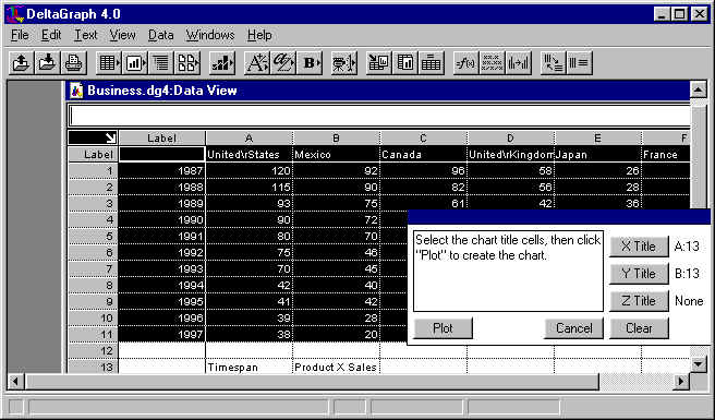
Type ‘Timespan’ into cell A13, and ‘Product X Sales’ into cell B13.
Then click on ‘Titles’ in the floating window, select cell A13 and click on ‘X Title’.
Similarly, select cell B13 and click on ‘Y Title’.
Finally, select all the data for the chart by dragging from the top-left cell to the bottom cell (F11) in the France column.
The Deltagraph window should now look something like:-
Now click on ‘Plot’ in the floating window. Then, after selecting Hide Background from the Page menu, the column chart should be drawn as follows:-
... which is the same as the chart we set out to draw at the start of this section.
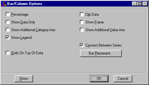
2-D Column Chart Options
If (making sure that the 2-D column chart is selected) you select Options... from the Chart menu, the following dialog box should appear:-
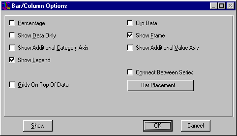
The various parameters that can be set operate as follows:-
Click on the Show button to preview your changes without exiting the dialog. This allows you to experiment with different options and assess their effects without committing to a redrawing of the chart. If selected, the dialog box will shrink to its title bar. You can restore it by clicking on the zoom box (second from the right). You can drag the dialog box out of the way by dragging on its title bar.
When you have achieved the required effect, click on OK. If you want to exit from the dialog box without making any changes, click on Cancel.
Example
As an example of the effects of varying the options, try setting the Connect Between Series option as follows:-
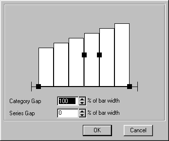
And then set the Bar Placement options as follows:-
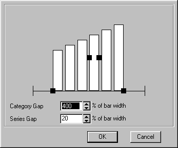
Now redraw the graph. It should look like:-
Try experimenting with the various options to see the sorts of effects produced.
__________________________
Graphics Multimedia Virtual Environments Visualisation Contents