
|
||||
| Also available as an Acrobat File | 

|
|
Contents
Main Report RecentDevelopments Examples Conclusion Weblinks |
Review of Visualization in the Social Sciences: Main ReportHistoryAlthough history is not strictly a social science, a number of interesting interdisciplinary examples of visualization using historical data have been surveyed, many on the Web. In circumstances similar to the visualization of spatial data, specialist techniques have also been developed for the visualization of temporal data. An example is the visualization of historical data in three-dimensional space, using event histories as a case study (Francis and Fuller, 1996). An event history is a sequence of events and states, the associations between them and their changes over time. Event histories of a similar type may be recorded for a number of individuals in a sample population. The problem is to display a number of event histories in such a way that relationships between variables in any event history are readily viewed, as are trends in all histories. This has been achieved by using 3D Lexis Pencils (Figure 6), a technique developed from 2D Lexis Diagrams (Keiding, 1990), that represent changes of throughout an individual's history by using changes in the colour, shading and height of the pencil.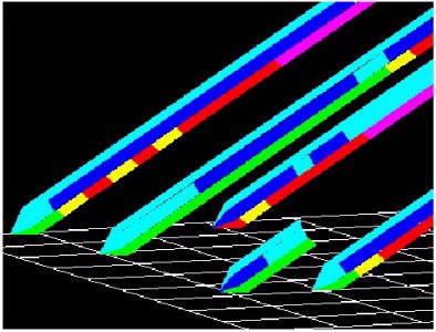 Figure 6 A Lexis pencil represents the event history of one individual or sample and consists of one or more parallel faces, aligned typically like the faces on a real pencil. As the length of the face, normally representing increasing time, is traversed, the changes of state of the variable associated with the face are denoted by changes in colour. Multiple event histories can be displayed using Lexis plots, which uses a Lexis pencil for each case history. The input event history data file contains a number of data variables, any of which may be selected for the three co-ordinate axes. Normally the Y-axis will be assigned a variable which is some measure of time whilst there will normally be one variable which is an index of the case histories. Any of the remaining variables may be used to "paint" the faces of the Lexis pencils with colours according to the value of the variable. Such display variables may take integral values while axis variables may take any real values. The resulting "geometry" is displayed in a window together with a set of axes and annotation. Examples of using Lexis pencils and Lexis plots to display event histories includes the unusual topic of the criminal careers of bigamists, which concludes that bigamists are often involved in fraud but not sex offences [49]. Other projects on the Web dedicated to exploring methods for visualising event history data in the social sciences include the Lifeline Project [8]. The Lifeline Project examines how life histories can be visualised using existing techniques developed in time geography. Time geography developed sophisticated visualization techniques to represent individual life courses, such as in Figure 7, taken from Carlstein et al (1978), but they have been used only rarely due to the great cost in time of producing them manually. A further problem is that by representing the experience of a group on paper, the graphic begins to run short of dimensions. 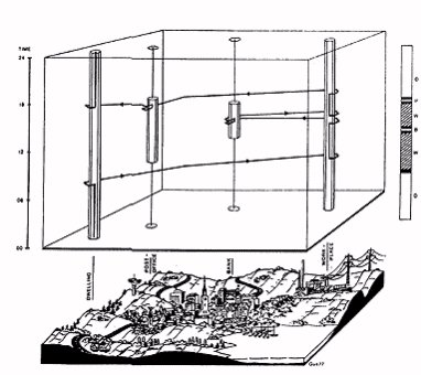 Figure 7 These constraints in space have lead to lifeline diagrams, where each life history is shown by a single line or bar and events are indicated by symbols or changes in fill patterns along the bar. New visualization techniques however, are beginning to revitalised time-space geography due to the ability to visualise the relationship of space and time by new mapping and information retrieval techniques (e.g. Spiekermann & Wegener, 1994). By combining the traditional visualization techniques of time geography with hyperlink technology, it is possible to start from aggregated data, and then to move to more detailed individual data by clicking on a specific data point. This is exemplified using the migration patterns of members of the Steam Engine Makers Society, a 19th century trade union [8]. The Steam Engine Makers' database contains a mass of information on the life histories of several thousand individual members. The visualization tool on the web allows a simulation of a system that enables users to 'drill down' from the union as a whole, through the collective experience of members in a selected town to the histories of individual members (Figure 8). Although the above example concerns people's lives, the methods are also relevant to any entity that changes over two or more dimensions. | ||
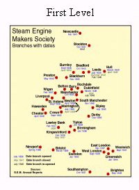 More details of the members in Bolton, and particularly their migration histories, can be found by clicking on either the name 'Bolton' or the circle that marks the town's location. |
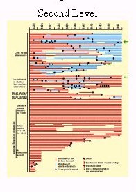 This lifeline diagram summarises the subsequent migratory histories of everyone who belonged to the Bolton branch of the SEM in 1835. The length of the line shows how far they can be traced. It is possible to find out more by clicking on their lifeline. |
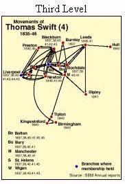 Thomas Swift joined Bolton in January 1834. He remained a member of Bolton until January 1842, when he moved to Liverpool. He returned from Liverpool to Bolton in January 1845, and remained a member through 1848/9. |
|
Graphics Multimedia Virtual Environments Visualisation Contents