
|
||||
| Also available as an Acrobat File | 

|
|
Contents
Main Report RecentDevelopments Examples Conclusion Weblinks |
Review of Visualization in the Social Sciences: Main ReportSocial Statistics Figure 11 Graphical methods in statistics have a long, if debated history. Although they appear to be commonplace adjuncts to most methods of statistical analysis, Anscombe (1973) has argued that more should be made of graphs in statistics, whilst Fienberg (1979) has reprimanded statistics for its lack of graphs and graphical experiments. For instance, although graphical methods for continuous data are well developed, similar methods for categorical data are still in their infancy [54]. This situation is slowly being addressed with work such as that located on the Michael Friendly website [54]. There, numerous examples of graphical methods for categorical data can be found (Figure 11). In terms of complex visualization techniques, however, one of the leading uses in social statistics has been in exploratory data analysis (EDA). EDA is an inductive approach to statistical analysis, and can be extremely useful for investigating complex relationships within datasets. This is becoming more essential as the typical social science dataset becomes more complex. Converting these data into useful, meaningful information can be extremely difficult and haphazard (Ondrechen, 1997). Visualization is being used increasingly as a method to overcome these difficulties, with recent software developments providing new tools for visualising multivariate data (Colet & Aaronson, 1995). For instance, Levin & Mitra (1994) describe a curve-fitting visualization programme designed to generate initial parameter estimates for non-linear equations, illustrating the process by modelling mortality data. Non-linear equations are notoriously difficult to solve, since a given equation can have an infinite number of often quite dramatically different solutions, all meeting the same specified goodness-of-fit criteria. Advanced visualization techniques can remove some of the inevitable trial and error process involved in solving such equations. A number of websites exist that promote statistical software packages that explore data in a highly visual way, such as the "Research Issues in Intelligent Data Visualization for Exploration and Communication" website [28]. Another example is the MANET (Missing Are Now Equally Treated) software website [69]. This has been specifically developed to provide highly visible facilities for the graphical exploration of multivariate data whose structure may prevent the use of analytic methods, particularly datasets containing missing values. Although the package is best used with non-spatial data, spatial data can be explored by the use of linked maps. This kind of dynamic mapping represents one of the most innovative uses of visualization in social statistics. Statistical maps have long served as the dominant technique for visualizing social statistics and increasingly statistical programming environments such as S-Plus and XLIS-STAT have been linked to GIS to allow the visualization, exploration and modelling of geographically referenced data (e.g. Gatrell & Bailey, 1996; Haining et al. 1996). This has been termed exploratory spatial data analysis (EDSA). There are now a growing number of software environments available that allow EDSA. Project Argus at Leicester University, [5] has currently developed a series of tools that promote this approach. The key product is the Cartographic Data Visualiser (cdv) developed by Dykes (1996). This is principally a map visualization toolkit with relatively modest computational and statistical capability (Wise et al., 1998). The bulk of cdv's facilities consist of graphical tools for viewing data, including a wide range of mapping options and some traditional graphs (Figure 12). The website includes a set of tutorials on cartographic visualization, some examples and exercises that demonstrate the use of the cdv and free down loadable software. 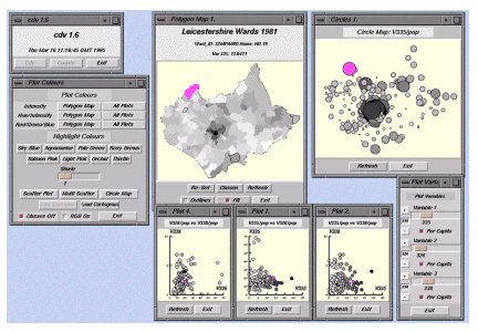 Figure 12 Therefore, using advanced visualization techniques, EDA and EDSA can act as a means of filtering extremely complex quantitative relationships among data into relatively simple, manipulatable graphical displays (Grande & Robinson, 1992). This has allowed users to interact with their databases in real time, dramatically increasing the amount of information they can extract. However, although visualization can provide a simple yet comprehensive overview of a large dataset, often visualization techniques fail to capture the essence of data trends. In addition, the ability to easily query any part of the data set frequently results in `information overload', and the need, often felt by researchers, to analyse their entire dataset which can be time consuming and can result in diminishing returns (Bormel & Ferguson, 1994). |
Graphics Multimedia Virtual Environments Visualisation Contents