
|
||||
| Also available as an Acrobat File | 

|
|
|
Visualisation in the Social Sciences WorkshopShow and TellMr S.M.Wise and Prof. R.P.Haining | |
Example of Visualization of Social Science Data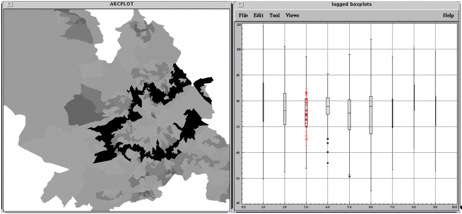
Our work has focused on methods and tools for the analysis of area-based data, particularly in connection with GIS. The image is a screen shot from a piece of software called SAGE (Spatial Analysis in a GIS Environment) developed by us with funding from an ESRC grant. Widely available software for analysing spatial data falls generally falls under one of two categories:
SAGE was written to bring together the strengths of both types of software, by linking a purpose written suite of spatial analysis tools with a GIS (ARC/INFO). An important element of SAGE is the provision of tools for supporting visualization, since such tools are extremely important in undertaking exploratory spatial data analysis, and in assessing some elements of model fit in confirmatory approaches. The image shows a map of Sheffield on the left, divided into 200 regions. Within each region information is available on the proportion of women who have used the breast cancer screening service offered by the local health authority. All women over 30 are eligible to use this service, but the proportion who choose to do so varies widely across the city. One possible explanation is the time taken to reach the only screening unit, located just west of the city centre, from different parts of the city. In order to explore this hypothesis, SAGE has been used to look at the variation in uptake rate of the service with distance from the unit. Each of the boxplots on the right is a summary of the rates in regions at increasing spatial lags from the region containing the unit - the first is for immediate neighbours, the second for second order neightbours etc. The third boxplot has been selected in the graphics window - since the two windows are linked, this causes all the regions to which this boxplot relates to be highlighted on the map. This is a means of checking that lag order is a reasonable approximation of distance from the unit. The graph itself indicates that there is no clear relationship between lag order and uptake, suggesting that distance from the centre is not a major factor in women's decision whether to attend for a scan. This is a simple illustration of how a visual technique can provide useful insight into spatial patterns and illustrates the following features of SAGE:
Contact DetailsMr S.M.WiseEmail: s.wise@shef.ac.uk Prof. R.P.Haining Email: r.haining@shef.ac.uk Department of Geography and Sheffield Centre for Geographic Information and Spatial Analysis University of Sheffield Sheffield S10 2TN Tel: 0114 222 7940, 0114 222 7905 |
||
Graphics Multimedia Virtual Environments Visualisation Contents