
|
||||
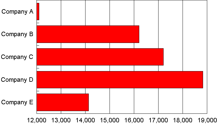
Bar charts are displayed horizontally across the chart, column charts are displayed vertically. The true bar chart is not often seen, but can be an excellent choice when the categories require complex naming. The paired bar chart is very effective in displaying the differences and similarities in two variables.
Stacked bars are useful in certain circumstances, particularly if there is a danger of cluttering the chart, but can prove difficult to interpret. Once again, the most effective chart is one in which the amount of information is understandable and which does not overwhelm the viewer or reader.
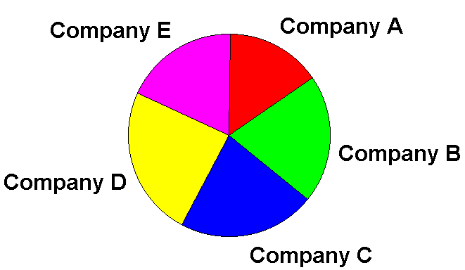
The Pie chart is most effective when displaying up to six variables, but these can be augmented with linked pies and columns. The exploded segment is useful for drawing attention to a particular segment, and can create striking visual effects. Many packages allow the data to be plotted as absolute values or as percentages of the total, and some have control over the orientation of the pie and the starting angle of the divisions. Multiple pie charts can be very effective.
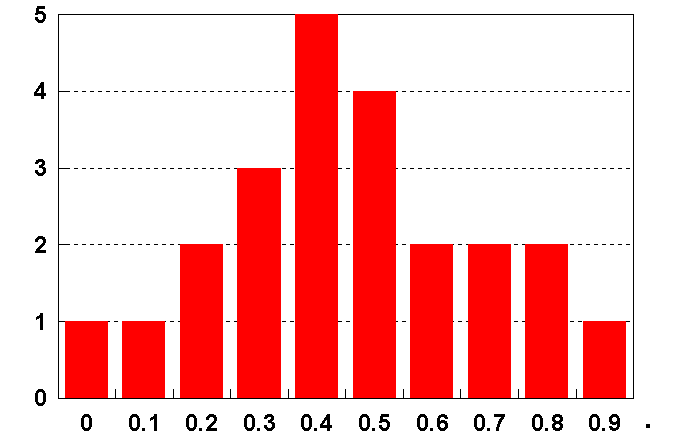
Confusingly, column charts are often referred to as bar charts. However histograms are a specific class of column chart associated with statistical work that calculates and displays the distribution of data in adjacent single columns of values