
|
||||
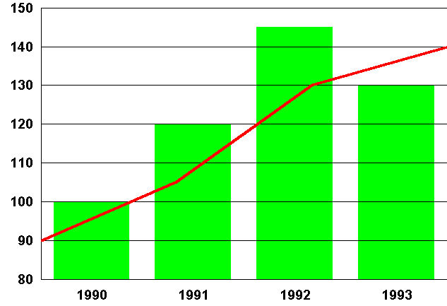
There are times when it is sensible to represent one set of data in one-way and another set in a different way, especially when a second Y-axis is used. This feature has generally been difficult to find in the graphical parts of spreadsheets and should be investigated early in the analysis of requirements. It is an effective tool in the right circumstances, but should not be overused.
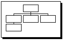
Organisation charts are useful for displaying management structures. The number of levels required must always be defined.
The text chart is perhaps the most widely used chart of all. Important limitations may cover subscripts and superscripts, foreign characters, chemical symbols and mathematical symbols. The most basic word processor can generally be of some use, although an early definition of the requirements for coloured text, gradient-filled backgrounds, imported bitmaps etc. will ascertain whether a word processor or a sophisticated presentation package will be needed. There is now considerable overlap in the facilities offered by word-processing, desktop publishing and presentation packages; the deciding factor maybe one of the choice and availability of output devices, or it may depend simply on personal preference and familiarity. In any event, it is essential that the package has all the facilities required; some DTP packages, for example, have very poor drawing facilities, while some modern WP packages have quite sophisticated drawing facilities. For the purposes of this document, text is considered to be a special case of graphics data.
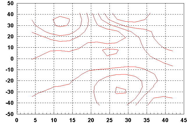
It is often necessary to be able to represent certain data as a2-dimensional surface in 3-dimensional space. In general, we wish to plot a function of the form z=f(x,y), where, typically, the x and y values represent the 2-D location of a point, and z represents the variable to be visualised. One method is to make use of contour lines, as in, for example, an Ordnance Survey contour map. In the case of a relief map, the altitude at points within the area represented by the map is the function concerned, and the grid reference coordinates of these points are the independent variables. Data visualised via contouring are typically measurements of the height of a particular landscape, but in fact, anything which is a function of two independent variables, and which can be measured in some sense, can be visualised via contouring.