
|
||||


A number of general points can be made on the analysis of the questionnaires completed. The commonest visualisation tool in use in the social sciences, excluding geography, is SPSS closely followed by Microsoft Excel. In many instances, though, even these relatively limited tools are being used essentially for data storage and quantitative analysis and not for computer graphics. In geography the situation is rather different. Here GIS tools are being used - the most popular being ARCINFO and ARCVIEW. A number of other packages are in use throughout the social sciences but, based on this survey, they are being used by very few researchers. The work of few social scientists would be adversely affected if only Excel, SPSS and ESRI products were available.
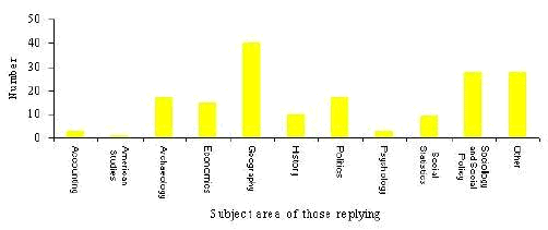
For the purpose of the survey we interpreted social sciences in a broad sense. We received replies from academics in the following subject areas within the social sciences:
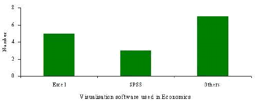
In economics Excel was found to be most frequently used followed by SPSS. As with archaeology, a number of other visualisation tools were used by individuals but, in each case, we received only one questionnaire referring to each tool. These included Microfit, Minitab and LIMDEP. All tools were used for visualisation data in a variety of graphs.
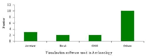
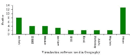
A wider range of visualisation tools were used in geography than in any other discipline. In total were received questionnaires from geographers making reference to 21 different tools. We received reports of eight software packages being used by more than one academic, again more than for any other subject area. As with other disciplines some visualisation tools were in far more common use than others were. The most popular included a range of GIS software - rarely used in other subject areas - and SPSS and Excel.
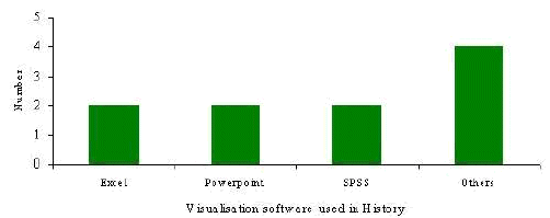
The response from history was disappointing. Only 12 questionnaires were received from members of history, economic and social history or related departments. Excel, PowerPoint and SPSS were found to be most commonly used but in each case we received only two questionnaires. Of the remainder a number of different image processing and display packages were listed. No academic made reference to the use of GIS software in his or her work.
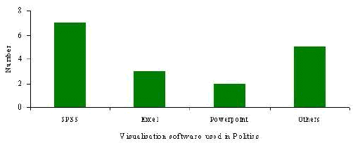
In politics three visualisation tools were in fairly common use - SPSS, Excel and PowerPoint. All these tools were used for visualising or presenting statistical data through the use of fairly basic computer graphics. Of the other software, for which we received no more than one questionnaire each from academics working in area, all but one was used for the same purpose as the commonly used software - visualising and presenting statistical data through graphs. One academic was using MapInfo to produce choropleth maps of Russia electoral geography.
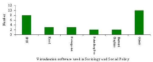
In sociology and social policy a wider range of visualisation software was found to be in relatively frequent use compared to politics. Again though, software was being exclusively to present statistical data through the use of simple graphs presented to students using software such as PowerPoint.
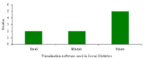
Perhaps not surprisingly, in the slightly amorphous area of social statistics, the most commonly used packages were the spreadsheet software Excel and the statistics software Minitab. It is, perhaps, surprising however, that SPSS and SAS with arguably more advanced visualisation (and statistical) features, did not feature more strongly.
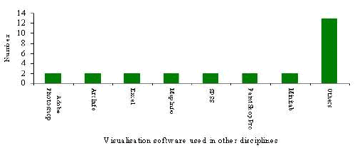
A range of visualisation tools were used in other disciplines, but none were in particularly frequent use as the final graph in this section clearly shows.
In addition some colleagues from outside the social sciences completed questionnaires. These included:
Graphics Multimedia Virtual Environments Visualisation Contents