|
||||
| Also available as an Acrobat File | 

|
|
Alternatives to choropleth maps |
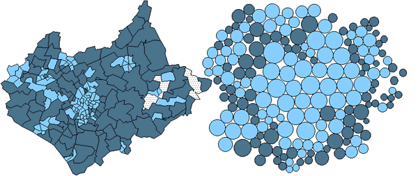
Maps of the Census: a rough guide5. Alternatives to choropleth maps: new interactive visualization toolsPre-computed non-continuous cartograms can be loaded into cdv. Those distributed with the example data sets use Dorling's (1996) algorithm. Dynamic links between abstract spatial views and the familiar polygons with their geographic locations and distinctive shapes, as illustrated in Figure 16, overcome some of the issues of interpretation and retaining zone shape and geographic distances inherent in the use of static cartogram projections. They can also be used to resolve some of the problems with mapping population information in static choropleths as outlined in section 2, including the projection problem. 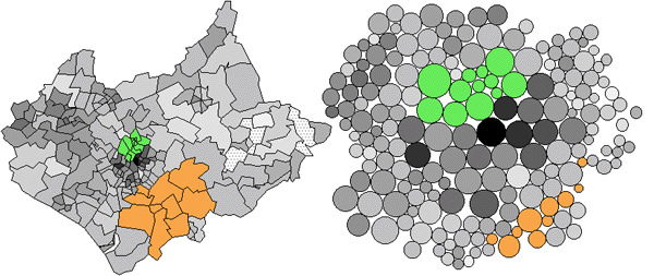
Figure 16: Linking between the views which display geographic boundaries and those containing non-continuous population cartograms aid interpretation of both views. Such linking techniques significantly diminish the justifications for using land-area maps for symbolising data about the population. Note the astonishing over-representation of the population in rural zones in the traditional land-area based projection. As Figure 17 shows, using cartograms can produce startling results. See, for example, how a traditional two-class choropleth showing car ownership / capita in Leicestershire reveals that the majority of the county contains people with above average access to private transport. The cartogram clearly demonstrates that the majority of the population live in areas where there is below average access to private transport.
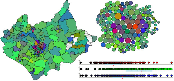
Figure 17: Leicestershire wards with above and below median values for car ownership per capita shown in dark and light colours respectively. Multivariate distributions can also be visualized with cdv. Research has suggested that certain types of map user respond well to combinations of symbolism for displaying geographic distributions of multiple variables. Cdv supports colour composites that define colours by their red, green and blue components. Different attributes can be assigned to each of the three primary hues and the range of data values attributed a strength of hue from 0% (minimum) to 100% (maximum). By combining red, green and blue percentages for each attribute, a colour is defined that is appropriate for the combination of variable values measured at each zone. The dynamic qualities of the software aid interpretation of these complex combinations of colour through a GUI that allows individual colour components to be turned on and off as required. Colour components can be used to symbolise any view. Three linked dot plots can thus be symbolised with component colours and combined with a composite map. Location is used to identify the statistical variation within variables in the dot plots, colour and linking between plots the multivariate nature of the each measurement zone and the coloured map the spatial variation of the three variables (see colour Figure 18).
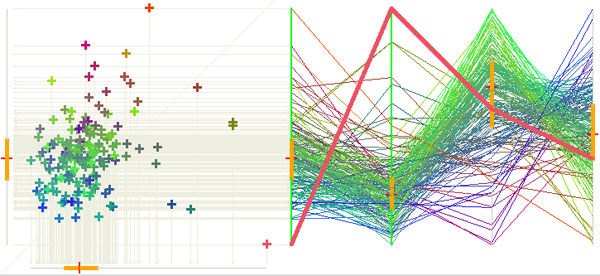
Figure 18 (Colour version only): A colour composite showing proportions of the population aged between 0 and 15, 25 and 5, and over 60 in red, green and blue respectively. A population cartogram is shown alongside the geographic projection. Dot plots display the statistical distribution of each component and the strength of hue contributed for each variable by each zone. A tool that allows more than three variables to be assessed in combination, by using location rather than colour, is the parallel co-ordinates plot (Wegman, 1990). Here the premise is that by using locations to show data values on orthogonal axes, as is the case with scatter plots, the number of variables that can be mapped in a plot is restricted to two, with the possibility of adding a third if a pseudo-3D projection is employed. By plotting data along parallel axes this number is increased dramatically and the variation of cases between variables can be assessed more precisely than in the 3D alternative. Effectively such plots are parallel dot plots with links between cases formed by lines rather than dynamic highlighting (Figure 19) and they allow more than three variables to be assessed concurrently. The distribution of lines, the patterns that they form, and envelopes that result, highlight outliers, multi-modal distributions, clusters, and the nature of relationships in multidimensional data space. In cdv, parallel coordinate plots link to the map and other views. There are n! (where n is the number of axes) possible views through this multidimensional data space The initial ordering of the axes chosen by cdv minimises Pearson's product moment coefficient between adjacent axes but dragging axes in real time will re-order them. Figure 19 shows how pairs of axes can be interrogated to display both the correlation coefficient and a scatter plot showing the relationship between any pair of variables.
Figure 19: A parallel coordinates plot showing the three age groups used in Figure 18, along with those aged between 16 and 24. The axes are ordered by age from left to right, but can be moved interactively. The scatter plot shows the relationship between selected axes on more familiar orthogonal axes. The coloured version retains the colour components used in Figure 18. |
Graphics Multimedia Virtual Environments Visualisation Contents