|
Editorial
Abstract
Introduction
The Issues
Numbers
Areas
Symbolism
Dynamic mapping tools
cdv
Alternatives to choropleth maps
Conclusions
Future directions
Acknowledgements
References
Case Studies Index
|
Maps of the Census: a rough guide
2.2 Issues concerning the areas
Whatever the numbers used, it should be obvious that the resultant map
depends just as much on the pattern of the zones employed in their collection,
their shape and areas, as it does upon the phenomenon under investigation. This
is one manifestation of the so-called modifiable areal unit problem
(MAUP) and it is particularly significant in the analysis of census data
because the enumeration areas are almost always relatively arbitrary (see
Unwin, 1981,116-119). The MAUP means that virtually any numbers collected over
such areas, including the ratios that are displayed on choropleth maps, will
depend greatly on the precise boundary definitions used. In the USA most of the
state counties are roughly the same spatial area, and this removes some of the
worst effects of the problem when we visualise data for aggregations across
them. However, the large spatial extent of each state means that there are
problems relating to a map projection component in any display of these data as
familiar projections do not display equal areas with equivalently sized zones.
In the UK census enumeration districts, which attempt (very unsuccessfully!) to
keep a roughly constant population in each unit, vary considerably in areal
extent and this can have a very marked effect on the appearance of our maps.
Figure 6 is a simple choropleth map of the electoral wards of Leicestershire at
the 1981 census shaded such that the shade of grey used in each zone is
inversely proportional to its spatial area. It can be seen that there is a
pronounced spatial variation in these values, with the zones, or resolution
elements (resels?) significantly smaller in the more densely populated
areas such as the cities of Leicester and Loughborough. In fact, although it
contains absolutely no census population count data at all, this map is very
similar to Figure 1, our population density map! Any map of census data using
zones of equal population will always have a bias towards the representation of
the larger spatial units in the less densely populated rural areas rather than
the possibly more interesting intricate detail within the cities. Quite apart
from any other statistical considerations, all visualisation of area value data
needs to be informed by knowledge about how the zones were defined.
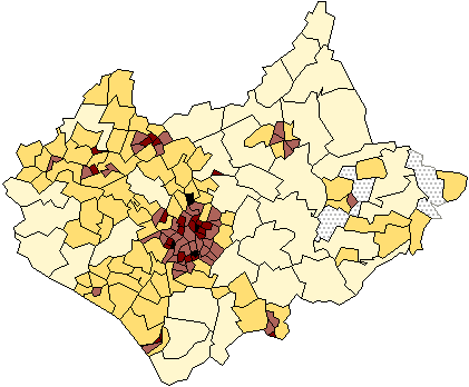
Figure 6: A choropleth map of the electoral wards of
Leicestershire at the 1991 census shaded such that the shade of grey used on
each zone is inversely proportional to its spatial area.
This area dependence is a fact-of-life in almost all geographical
visualisation. To escape it, three radical options have been suggested:
- The first is to display the census data on what is called a cartogram
base. As symbol size is frequently used to signify relative attribute
importance it seems contradictory to use a map base upon which symbol size
equates with geographic area. This is a largely arbitrary attribute appropriate
only if focusing on rural processes, using zone shape to identify the
geographic location or assessing distances. In population cartograms the zone
areas are themselves expanded or contracted according to the total number of
people (the denominator in any population ratio). At the cost of creating what
can be a very unfamiliar and seemingly distorted 'geography', this magnifies
small areas with large populations at the expense of areas that have very few
people. Typically densely populated inner city areas are magnified at the
expense of more sparsely inhabited rural ones. It can be argued that the
resulting cartography is not only better able to show greatly varying spatial
detail, it is also in some sense more socially equitable. In recent years,
cartograms have been used to great effect by Dan Dorling to visualise many
aspects of the social and census geographies of Britain (for examples, see
Dorling, 1995) and code (BBC BASIC, and C) published as part of a very full
technical monograph (Dorling, 1996). Figure 7 shows an area cartogram based on
the population values for the census zones of Leicestershire created using
Dorling's 'circle growing' algorithm.
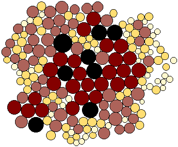
Figure 7: A non-continuous population cartogram based on the
population values for the census zones of Leicestershire created using
Dorling's 'circle growing' algorithm. Both the circle areas and shades are
proportionate to the zone populations.
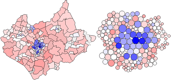
Colour Figure 4b uses the cartogram base to show the distribution of Figure 4,
highlighting the relatively small numbers of people in the identified commuter
belt which is over-represented by the land area map due to the large areas
which the commuters occupy.
- The second approach is to transform the census data onto a regular, high
spatial resolution grid such as that provided by the Ordnance Survey National
Grid, as suggested by Martin (1989). The details are beyond the scope of this
case study, but involve interpolation of the census totals from the irregular
units onto which they are aggregated by the then Office of Population, Census
and Surveys onto a very fine grid mesh of 200m side pixels. These data are
readily available for research use by academics in higher education in UK from
the MIDAS service at Manchester University. They enable displays of the
spatially continuous areal density of population (people per square km) to be
created. Figure 8 shows such a surface view of the population of Leicestershire
created using these estimates. The view is from the north west, so that we see
the towns of Shepshed and Loughborough as `hills' of relatively high population
density `in front' of the large `mountain' that is the county town of
Leicester.
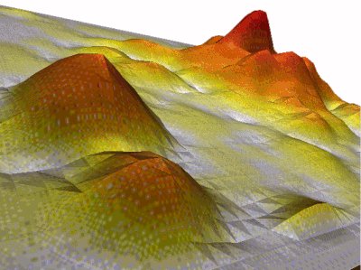
Figure 8: A surface view of the population of Leicestershire
created using the Martin 200m population estimates. The view is from the north
west. (Visualisation by courtesy of Kath Stynes, Ravenscroft
College)
- A third approach is to use external information to isolate only those areas
within the wards that have residential housing and then calculate the areal
densities using these areas rather than the total zone areas as denominator.
This is called dasymmetric mapping and it was originally proposed by
Wright (1933). In his original study Wright used inspection of a topographic
map as a basis for determining the residential areas, but in a recent study
Langford and Unwin (1994) used satellite remote sensing to achieve the same
result.
|


